Produces a bar chart of per-column similarity scores, with a horizontal line at the overall score.
Examples
# \donttest{
syn <- gaussian_copula_synthesizer(metadata(adult_income)) |> fit(adult_income)
synth <- sample(syn, n = 500)
qr <- quality_report(adult_income, synth, metadata(adult_income))
ggplot2::autoplot(qr)
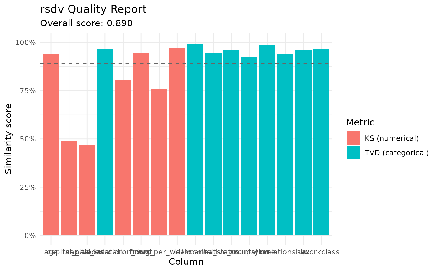 # }
# }